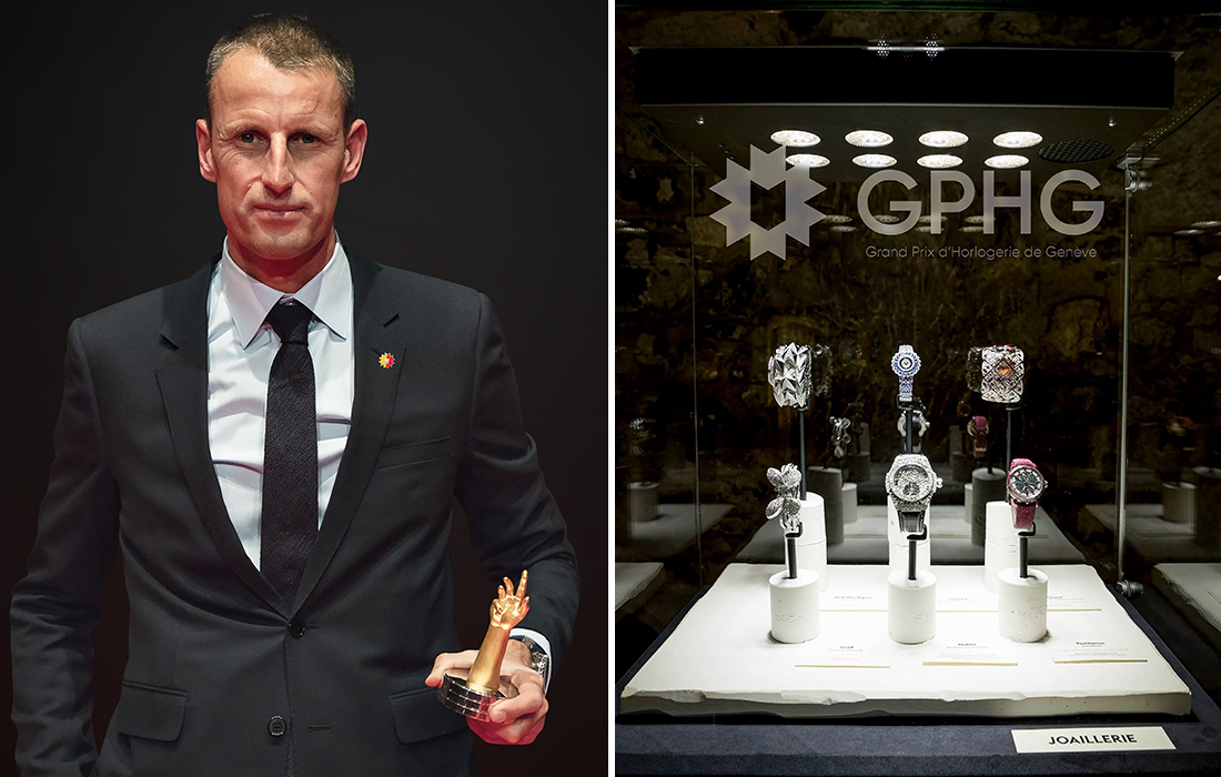
If you haven’t heard of the Grand Prix d’Horlogerie de Genève, it’s an industry-focused award event that brands strive to win, and often flaunt in their marketing materials. It’s an institution that aims to push brands further in terms of creativity and skill, resulting in horological delights and complications for our admiration. For me, however, one aspect of the GPHG that always misses the mark is its visual identity. As a designer, I have reached my breaking point – my hands can no longer rest idle. In short, we re-branded the organization, and I’d like to share the result with you.
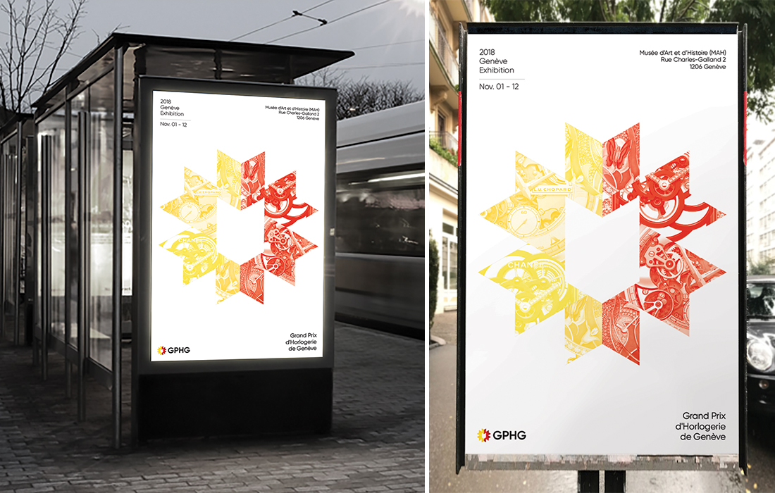
With bold simplicity comes great opportunity. Here is a sample advertisement using the form of the icon to crop out various details from GPHG-nominated watches.
Now don’t get me wrong, I am a committed fan of the event and its promotion of watchmaking. It’s just that the GPHG logo has never felt quite “Swiss” to me. Other than the reference to Geneva’s coat of arms and flag, I’ve always felt that something was missing in its execution. But let’s back up a bit first.
Growing up in Canada, I came to identify the Swiss through two cultural exports: 1) watchmaking and 2) graphic design. These two things have been instrumental in shaping my life, and I have pursued both with fervor for as long as I can remember. I recall when, during my final assessment in design school, a professor approvingly declared, “I would almost think you are Swiss, Matt!”

A sample GPHG invitation using the deconstructed geometry of the logo to create a Swiss-influenced pattern.
That was thirteen years ago. Since then, I’ve worked my way through the ranks at various agencies and eventually decided to go out on my own. I built Sentient Creative around my personal values of design and business, and I’ve never looked back.
What’s more, I have been able to translate my passion for design to clients, projects, and ultimately funds for more watches. The point is, the marriage between design and watchmaking still shapes my day-to-day. So, during the summer of 2017, I decided to scratch my creative itch and put my small studio to work rebranding the GPHG.
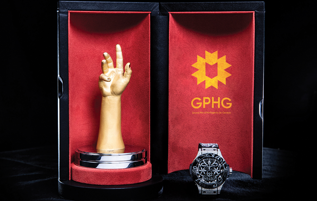
A color example of our proposed logo, as featured in the GPHG trophy case. The trophy itself was designed by Roger Pfund and was inspired by Michelangelo’s ‘The Creation of Adam.”
Not that they asked us, but I felt compelled, even possessed, to create something that embodied classical Swiss design. At some point during the exercise, I realized we should share our solution with the GPHG and the larger horological community. Our hope was that they would see the value of our proposal and put our solution to use. And we figured that if they liked it, we’d just let them have it. Afterwards, I could rest easy as the watch nerd and designer I am, knowing that we had done our duty.
Now let’s get down to it.
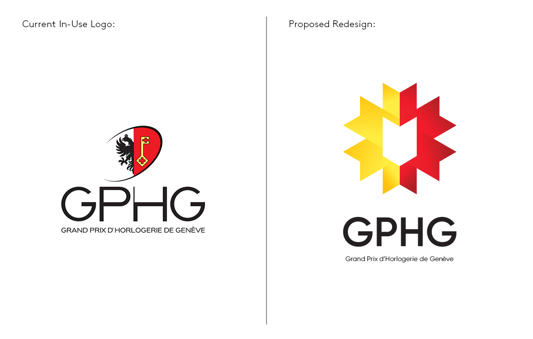
As readers are most likely aware, the image at left is the Grand Prix d’Horlogerie de Genève’s former logo, a stylized depiction of the Geneva Coat of Arms, which also appears on the Geneva Seal. At right is our stripped-down proposal for the redesign.
Now, receiving the Geneva Seal is certainly prestigious, but the GPHG is something else altogether. It’s something more, an additional accolade, well-established on its own merits. We opted to preserve some visual references to its distinguished history while incorporating modern elements to create a unique but timeless aesthetic. Since brands typically use the GPHG logo in their marketing materials after placing in the competition, we wanted to make sure the brandmark looked like an actual badge of honor. We also simplified the logo to deliver a more focused impact and improve legibility. The current emblem’s inability to scale well on-screen (i.e. on banner ads or low resolution thumbnails) limits its efficacy.

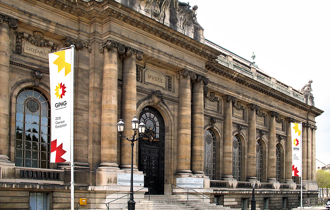
As demonstrated by this mock-up, our proposed redesign maintains visibility and legibility even as a small lapel pin.
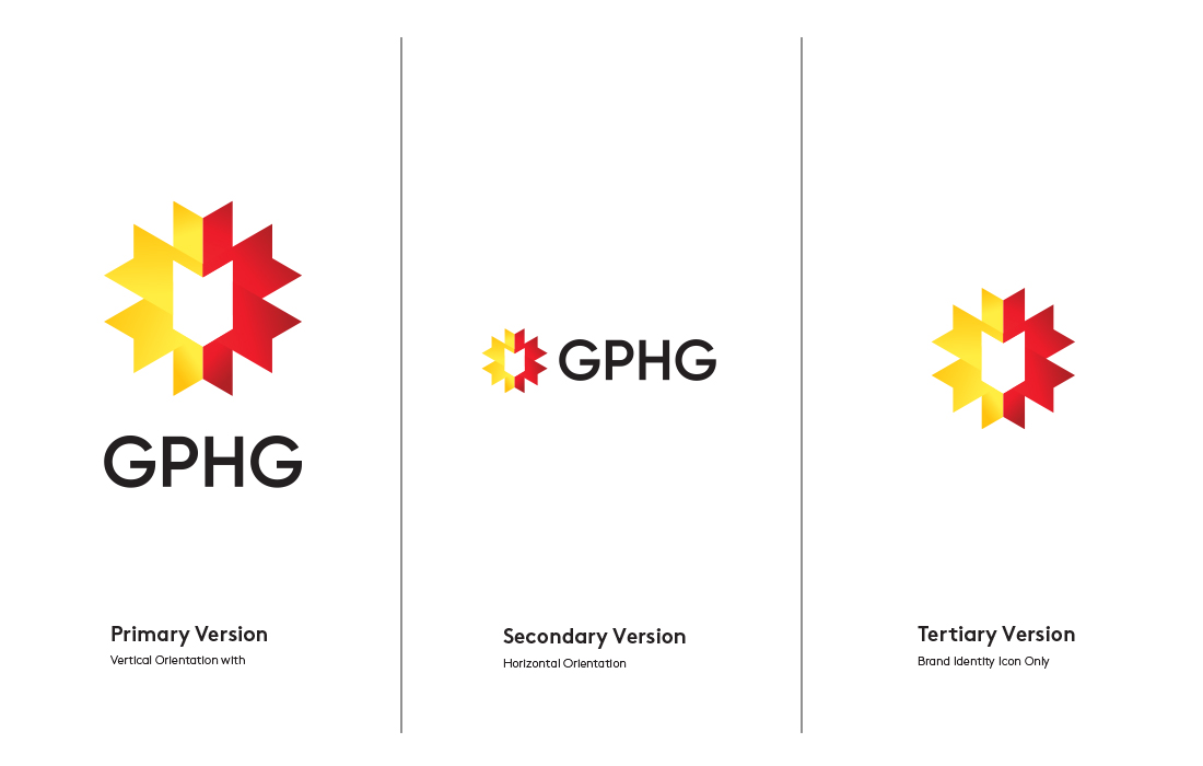
Our proposed design solution also has meaning: the ribbon motif’s twelve points represents the number of categories in the GPHG and coincide with the number of hour markers on a typical watch face. The shield-like shape in the center alludes to the Geneva Seal and represents our commitment to the protection of watchmaking in the face of rapid modernization. Furthermore, the shape of the ribbon’s individual segments are reminiscent of prize ribbons. If the average person saw this design pinned on a brand’s Instagram post, they’d know they were looking at a winner even if they were unfamiliar with the GPHG. Oh, and of course, the colors harken directly back to the Geneva flag and coat of arms.
It took us the better part of a year to develop what we believe to be the appropriate solution, and we definitely feel like we have a winner. We hope the Grand Prix d’Horlogerie de Genève is listening and will enable us to make a contribution, however small, to the legacy of horology. We’re also aware that unsolicited advice can sometimes appear pushy, but heck, the GPHG has been pushing brands to new creative heights for years. Our admiration and respect for the GPHG inspired us to return the favor.
I’d like to thank Sian Lee, the designer who was instrumental in bringing this vision to life with me over the past few months. I hope we get our chance to leave a mark on something we love.
from Best Watches For Men https://ift.tt/2GFuvcM
